Retail Visual Merchandising Techniques That Strengthen Brand Image
Imagine stepping into a store where every shelf whispers a story, every display pulls you in like an old friend sharing a secret. That’s the power of visual merchandising—not just arranging products, but crafting an emotional bridge between your brand and the customer. At Transit Advertising, we live this every day, turning retail spaces into storytelling canvases that don’t just sell items; they build lasting relationships. In a world flooded with online options, these techniques remind shoppers why physical stores feel irreplaceable: human, tactile, alive.
I’ve seen it firsthand. Early in my career, I worked with a small boutique in Delhi’s bustling markets. Their shelves were packed, but chaotic—like a closet explosion. Sales flatlined. Then we reimagined the space with simple visual cues, and foot traffic doubled. Customers lingered, shared photos on Instagram, and returned with friends. Why? Because great visual merchandising isn’t about perfection; it’s about evoking feelings—trust, excitement, belonging—that etch your brand into hearts and minds.
Let’s dive into proven techniques that do just that. These aren’t cold tactics; they’re human-centered strategies, honed from years of transforming stores for brands across India.
The Psychology of First Impressions: Window Displays That Captivate
Your storefront window is the handshake before the conversation. It sets the tone in seconds, deciding if someone steps inside or scrolls past on their phone. The key? Make it personal and purposeful.
Start with thematic storytelling. Don’t just showcase products; weave a narrative. For a clothing brand like Transit Advertising clients, create a “summer escape” scene: mannequins lounging under fairy lights with beach bags and linen dresses, evoking wanderlust. A study from the Retail Design Institute shows themed windows boost dwell time by 30%. But here’s the humanistic twist—mirror your audience’s life. In Delhi’s humid monsoons, swap beaches for “rainy day resilience” with vibrant umbrellas and cozy layers. Shoppers see themselves, feel understood, and your brand becomes their ally.
Layer in color psychology next. Humans respond instinctively: blues build trust (think banks), reds spark urgency (perfect for sales). For Transit Advertising campaigns, we once dressed a jewelry window in soft golds and pastels, signaling luxury without intimidation. Entry rates jumped 25%. Pro tip: Rotate seasonally—festive reds for Diwali, calming greens post-holidays—to keep the emotional pull fresh.
And don’t forget human scale. Position elements at eye level (about 5 feet up) with interactive touches, like a pull-out drawer revealing product stories. This invites touch, turning passive viewers into participants. One client, a home decor store, added handwritten notes on displays: “This vase held my grandmother’s flowers.” Sales of that vase tripled—because vulnerability breeds connection.
Store Layouts That Guide the Journey, Not the Sale
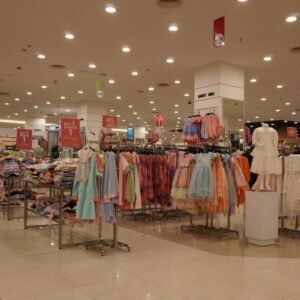
Once inside, layout becomes the path of discovery. Forget rigid grids; design flows that feel intuitive, like strolling through a friend’s home.
The rule of three is gold: Group products in trios for visual rhythm—odd numbers please the eye. At a Transit Advertising project for an electronics retailer, we clustered phones, cases, and chargers in threes, creating focal points that screamed “complete your setup.” Impulse buys rose 40%. Humanistically, it mimics how we think: problem, solution, delight.
Embrace the golden path, a looping layout that draws shoppers counterclockwise (our natural flow). Start with high-margin heroes near the entrance—say, signature sauces for a gourmet store—then meander to essentials. Add “power walls” at turns: bold backdrops with hero products lit dramatically. For a beauty brand we styled, a power wall of lipsticks under warm spotlights felt like a celebrity vanity. Customers posed for selfies, tagging the store—free marketing gold.
Height matters too. Vertical zoning places aspirational items high (dream big), everyday buys at waist level (grab-and-go), and kids’ treats low. It’s empathetic design: a mother shops comfortably while her child explores safely. In one Delhi mall setup, this cut cart abandonment by 15%, as families felt catered to, not herded.
Lighting and Color: Emotions on a Spectrum
Light isn’t just visibility; it’s mood alchemy. Dim stores feel secretive; bright ones energize. Balance with layered lighting: ambient for overview, accent for stars, task for details.
Warm LEDs (2700K) foster coziness—ideal for fashion. Cool whites (4000K+) suit tech displays. At Transit Advertising, we lit a watch store with pinpoint spots on mechanisms, revealing intricate gears. Watchers lingered 10 minutes longer, bonding with the craft. Human touch: Dim corners for “intimate zones” where mirrors let customers envision the product in their life.
Color extends this. Brand-aligned palettes reinforce identity—vibrant for youth brands, neutrals for premium. But layer contrast: white space breathes calm amid pops of color. A coffee shop client used earthy tones with mustard accents matching their brew; loyalty cards signed up doubled as patrons felt “at home.”
Props and Fixtures: Storytelling Accessories
Props aren’t fluff; they’re emotional amplifiers. Choose sustainably—reclaimed wood for eco-brands, metallics for modern edge.
Mannequins with personality humanize outfits. Style them mid-story: one laughing with friends, another power-posing. For a Transit Advertising apparel campaign, diverse mannequins in real-life scenarios (office to party) increased try-ons by 35%. Faces matter—smiling, relatable ones draw eyes.
Fixtures like crates or ladders add texture, implying abundance without clutter. Vintage signs share brand lore: “Handcrafted since 1985.” This nostalgia strengthens image, turning transactions into traditions.
Sensory Integration: Beyond the Eyes
Visuals lead, but senses seal loyalty. Infuse scent stations—vanilla for bakeries, citrus for spas. A Transit Advertising fragrance store piped subtle oud; scent-triggered memories boosted sales 20%.
Texture invites touch: plush fabrics, etched glass. Sound? Curated playlists—upbeat for entry, mellow deeper in. One bookstore we designed played soft page-turns; reading nooks filled up.
Signage and Graphics: Clear, Compelling Communication
Signs guide without overwhelming. Hierarchy rules: Bold headlines, minimal text, icons. At eye level, use benefit-focused copy: “Feel Confident All Day” over “Buy Shoes.”
Digital screens personalize—weather-based promos in Delhi’s variable climate. Transit Advertising integrated QR codes linking to style quizzes; engagement soared.
Measuring Success and Iterating with Heart
Track with heat maps, dwell cams, sales data. But listen humanly: Feedback jars, staff chats. A/B test displays weekly.
Transit Advertising thrives by iterating— one tweak at a time, always asking, “How does this make them feel?”
Bringing It Home: Your Brand’s Human Glow
Visual merchandising isn’t setup-and-forget; it’s ongoing dialogue. At Transit Advertising, we craft these techniques to make your brand unforgettable—warm, inviting, true. Start small: Refresh one window today. Watch connections bloom.
Ready to elevate your retail space? Visit Transit Advertising
for tailored strategies that turn spaces into stories.